
Author Archives: Laura Montgomery
Create a jQuery Tooltip!
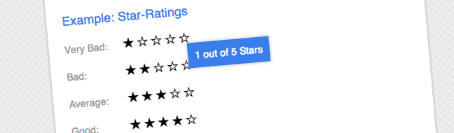
In this article I am going to show you how to create a simple Tooltip effect using jQuery. What’s great about this method is that it degrades gracefully, so if someone doesn’t have Javascript enabled they don’t see anything out of place.
The tooltip that we will be creating will appear when we hover over a link. We will use the HTML5 custom data attribute (data-*) to hold our information, then use jQuery to dynamically create a container (div) to hold the information within the custom data attribute.
This tutorial assumes that you have some understanding of jQuery but I’ll be explaining everything as we go so should be good for beginners as well. You will also need to understand HTML and CSS.
Posted in jQuery, Tutorials
Read More
|
8 Comments
jQuery 101 – Learning the Basics

By now most web designers and developers have a very good understanding of jQuery and its capabilities; for most it is their go to JavaScript library when adding some additional functionality or interactivity to their web pages.
However there are still plenty of people out there who are new to web development and who would like to get started with this great language but don’t know how to.
Well, this one’s for you!
In this tutorial aimed at absolute jQuery beginners you’ll learn about:
- What is jQuery?
- Installing the jQuery Library
- The Document Ready function
- .click() and .hide()
- Understanding the Syntax
- .toggle()
- .slideToggle() and .find()
- Animation Speed
- .css(), this Selector and Basic Selector Filters
- .hasClass(), .addClass(), .removeClass() and if Statements
Lots for the absolute beginner to get stuck into and see what the world of jQuery has to offer.
8 Take Away Thoughts from New Adventures 2012
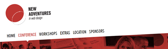
A few days ago I attended the New Adventures in Web Design conference 2012 in Nottingham. This was my first conference so I didn’t really know what to expect or what I would get out of the experience. Therefore I’m not going to compare this experience to a previous conference or comment on what they could have done or should not have done as I am not aware of the usual conference status quo. Plus I think the team behind the conference did such a wonderful job and I really cannot fault them on any area.
Instead I’ve decided to write about what I took away from the conference in terms of inspiration and professional knowledge. There were 8 speakers at the conference so I thought that I should write about the main point that I took away from each talk. These are of course my own take away thoughts and not necessarily the focus of each talk – although generally speaking, that is the case.
Posted in Professional Knowledge
Read More
|
2 Comments
Mid-week Inspiration #9

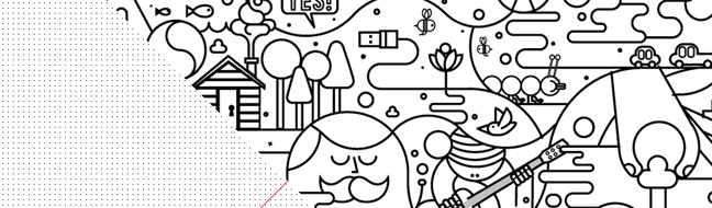
It’s that time of the week again, time for some mid-week inspiration from Creative Individual. This week I’ve put together a bit of a mixed bunch – there’s lots of different styles on show in this week’s collection. From fun and simple, to highly polished with an impressive amount of illustrative detail, and others somewhere in-between – there’s something to suit everyone’s tastes and styles.
Posted in Showcases
Read More
|
Leave a comment
Photography Showcase: The Four Elements Part 1: Earth

This is the first photography showcase on Creative Individual and I’ve decided to make it the first in a four-part series. The series is The Four Elements – namely earth, wind, fire and water. And in part one, I’ve put together some interesting and inspirational images around the subject matter of Earth. More specifically I’ve selected images of rocks, cliffs and rock formations.
Posted in Showcases
Read More
|
Leave a comment
Just For Fun: The Kerning Game

I recently came across the Kerning Game and felt I just had to share it. It is a great game for graphic designers and those interested in typography.
The object of the game is simple: move the middle letters in each word to make the text both visually pleasant and, more importantly, easily readable. Or in other words, kern the text. You then receive points according to how well you did.
Posted in Typography
Read More
|
1 Comment
Mid-week Inspiration #8 – 10 Fresh Sites

Happy New Year and welcome to the first edition of Mid-week Inspiration in 2012. To get you inspired after the long christmas/new year break I’ve put together 10 sites which are fresh, clean, and a little bit different – helping you get those creative juices flowing!
Posted in Showcases
Read More
|
Leave a comment
Mid-week Inspiration #7 – Diagonal Lines & Animation
This week’s mid-week inspiration is a small collection of only 3 sites but ones which I think are good enough to stand up as prime examples of an emerging trend.
Recently I came across the Citroën DS5 website which blew my mind. Using bold diagonals and lots of CSS3 transitions and Javascript to create some mind boggling animations, this site shows what can be done when technical capability and extraordinary imagination meets the guts to give it a go.
Check out this week’s short, but very sweet, collection of inspirational sites which use diagonal lines and animation to drive home their message.
5 Sources of Online Inspiration You Can’t Live Without
Welcome to the second edition of 5 You Can’t Live Without. In this edition I am going to share 5 sources of online inspiration that I recommend every website designer is familiar with. The focus of the websites I’ve included is particular to following design trends and developing your own style.
This one was an interesting list to put together with so many great online sources out there and that is why I have decided to focus on the artwork angle in particular. So, let’s find out what sites have made my Top 5 list, and which one I consider to be number 1.
Posted in 5 You Can't Live Without, Design
Read More
|
1 Comment
Designing for Humans

By it’s nature the web can be a pretty cold place. Reading on screen can be hard and websites can look boring at times; and at worst, confusing and uninviting.
When we come across a site that’s different for all the right reasons, it often sticks in our head because it was an enjoyable experience. Can you remember a site that was warm and welcoming? Where the text was clear and easy to read? The navigation was easy to follow? That site was well-designed. Its designer had the end-user in mind at all times during the design process.
There are not always set ingredients which make the perfect website cake, but there’s certainly plenty of ways to improve your website, and in turn, a user’s experience; to make your site a nicer place to be.
Posted in Design, Professional Knowledge
Read More
|
2 Comments
 Creative Individual is written by Laura Montgomery, a Website &
Graphic Designer based in the lovely Lake District, Cumbria. Laura is a
nice girl who is always interested in hearing from others, so please feel
free to
Creative Individual is written by Laura Montgomery, a Website &
Graphic Designer based in the lovely Lake District, Cumbria. Laura is a
nice girl who is always interested in hearing from others, so please feel
free to