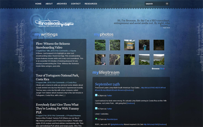
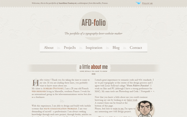
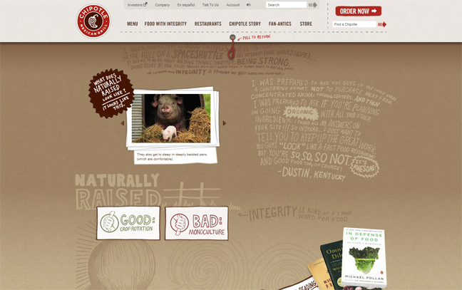
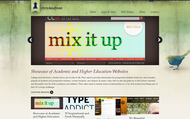
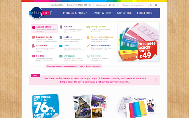
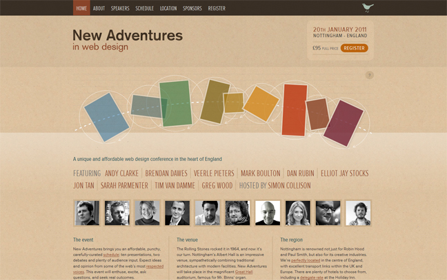
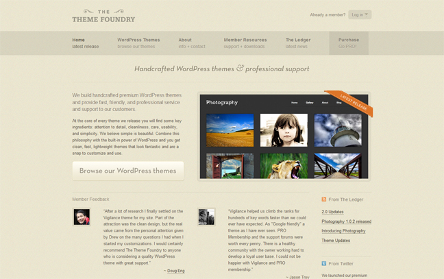
It’s that time of the week again! Welcome to the second instalment of mid-week inspiration from Creative Individual. This week’s selection of websites follow the theme of ‘Paper Textures in Web Design’. This week’s sites show just how effective a little bit of texture can be when bringing your website to life! Enjoy!
What do you think about texture in website design? Which site is your favourite? Please feel free to leave your comments below.


 Creative Individual is written by Laura Montgomery, a Website &
Graphic Designer based in the lovely Lake District, Cumbria. Laura is a
nice girl who is always interested in hearing from others, so please feel
free to
Very nice post!
Thanks for the support. There’ll be lots more like this in the future.
Very cool post, thanx.
Awesome Blog. I will be back to see more.
glad I stumbled upon your site, a lot of great posts!
nice post
nice to see
Thanks Raj – if you have any to add yourself, please feel free to add yours in the comments. And thanks for visiting the site.