I find that Adobe Illustrator can be a very flexible tool for creating print-ready artwork, especially for page layout where you don’t need any more than a couple of pages. This tutorial will show you how to create a stylish business card which is ready for professional printing, using just a few simple tools in Illustrator.
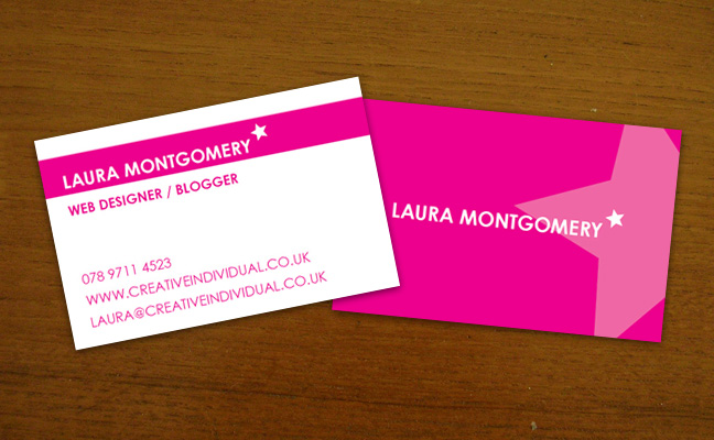
In this tutorial we are going to create a 1 process colour business card, namely magenta, which has a 3mm bleed and a 5mm quiet zone. Don’t worry if you don’t know what this all means, things will become apparent as we go through the tutorial. My business card’s final size is 85 x 55mm (width x height) but you should check with your local printer what size they prefer before creating your artwork.
Let’s Get Started
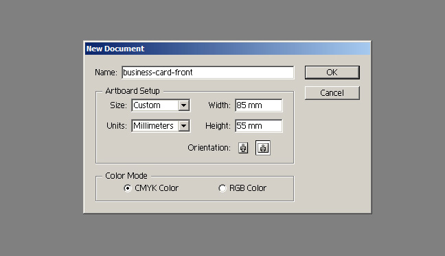
First open up Adobe Illustrator and create a new document that is 85 x 55mm (or whatever size your printer recommends). Make sure to set the Color Mode to CMYK (for printing) as opposed to RGB (for screen).
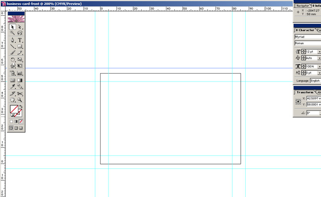
Once you have your new document, I recommend setting up some guides as a visual reference to let you know if you’ve going off-track. If they are not already visible, press CMD/Ctrl + R to show the page rulers.
First set up the bleed – the bleed essentially means you’ll make an image larger than your final artwork so that you can have colour right to the edges. It means that when the printer trims the paper, there is no chance of accidentally getting an unsightly white edge!
My printer recommends 3mm bleed, again you should check what your printer prefers. My guides need to be set 3mm outside the artwork box. The left guide is positioned -3mm on the x co-ordinates while the right is 88mm, the top guide is 58mm on the y co-ordinates while the bottom is -3mm.
The quiet zone again saves us from potential errors caused by any shift in the trimming process and also keeps our artwork looking tidy by not having text run all the way to the edge. I’m setting my quiet zone to 5mm. So the left guide will be at 5mm on the x co-ordinates while right is 80mm, the top guide is at 50mm on the y co-ordinates while the bottom is at 5mm.
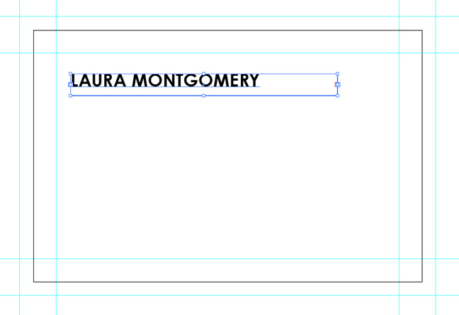
Once you’re all set up, it’s time to get started and create the artwork. Grab the Type Tool (or T on your keyboard) and create a text box. Type your name or business name and select a strong typeface – I’ve opted for Century Gothic in bold.
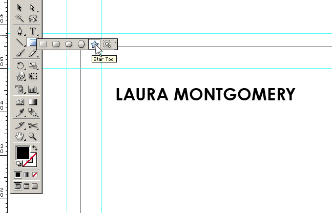
Next we are going to add a star shape using the Star Tool. If you’ve never used it before, you’ll find it amongst the shape tools, most-likely fronted by the Rectangle Tool as shown above.
Just like the Rectangle Tool, if you click once on screen with this tool selected, you can enter in exact co-ordinates to help you create the perfect star for your artwork.
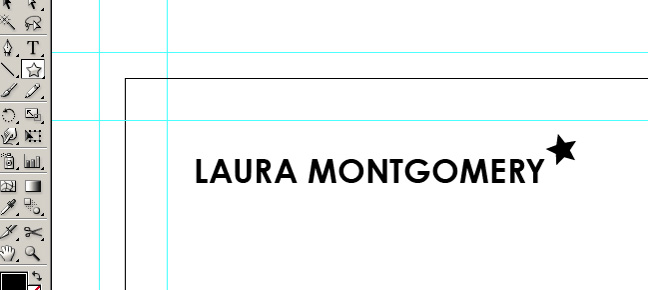
Create the star and position it beside your name. You may need to experiment with the size a bit to get the effect you are completely happy with. I recommend holding Shift while you scale the star up and down using the Selection Tool (or V on the keyboard) to keep it’s proportions correct. I’ve also rotated my star slightly to add some character.
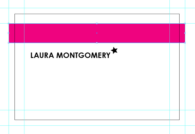
Next we are going to create a magenta band of colour by using the Rectangle Tool (or press M on your keyboard). Like with the Star Tool, simply click once on screen to enter in the exact co-ordinates. I’ve created mine at 91 x 10mm – this means it runs from bleed guide to bleed guide and is 1cm tall. I’ve also positioned it just on the edge of my quiet zone, meaning when trimmed, my card with have a 5mm white band at the top. Make sure the colours in the colour pallette are set to 0, 100, 0, 0 for 100% Magenta.
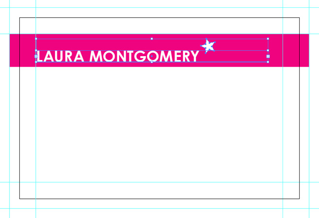
Next select both the text and star and group them (CMD/Ctrl + G) and then position your logo inside the magenta band of colour. You will need to bring the logo to the front by pressing Shift + CMD/Ctrl + ] on your keyboard otherwise it will be hidden beneath the band of colour. Don’t forget to change the text to white, otherwise we are no longer preparing artwork for 1 colour-process printing.
Again, keep the logo outside the quiet zone. You may also wish to scale the logo up or down – don’t forget to hold Shift while using the Selection Tool (V) to keep the proportions.
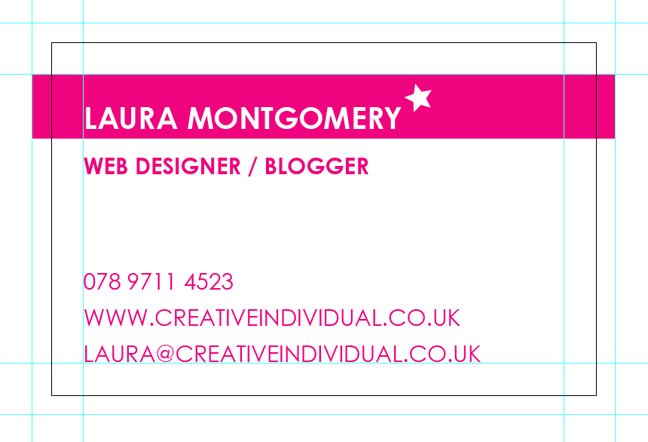
Create another text box using the Type Tool and enter in your details. I’ve decided to create one box with type in bold for my occupation, and another in regular for my contact details (p.s. that’s not my real telephone number). I recommend keeping all your text boxes aligned to one another to keep everything looking professional, so on this case I’ll position all my text boxes and logo to the left edge of the quiet zone.
We have now finished the artwork for the front of the card. Save your artwork as ‘business-card-front’, then duplicate the file, renaming it as ‘business-card-back’. We now have the back of the business card already set up with guides and logo ready to use.
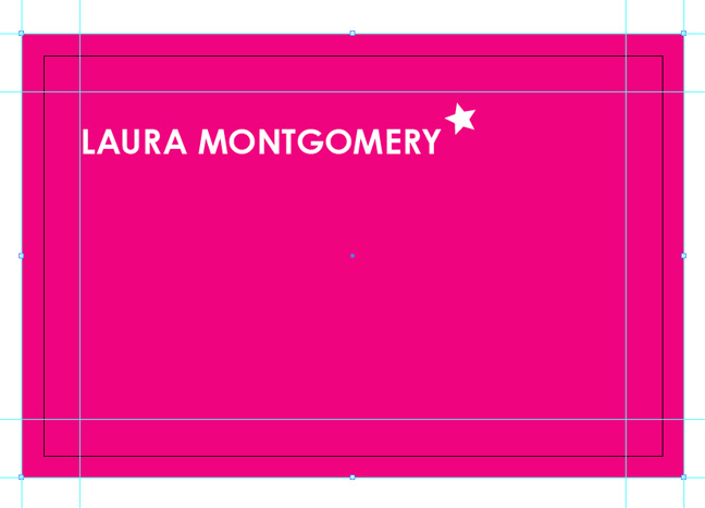
Open your new file ‘business-card-back.ai’ and delete the contact details. Resize your band of magenta to 91 x 61mm and make sure it lines up with the bleed guides on all sides.
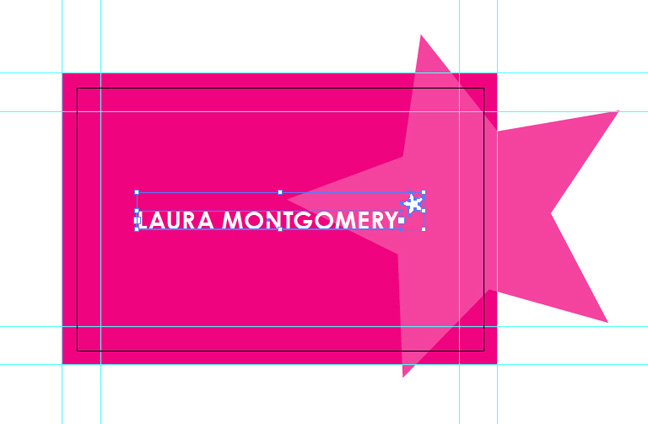
Grab your Star Tool again and create an oversized star graphic. Change the star graphic colour to 75% Magenta, i.e. the CMYK colours in the colour-palette will read 0, 75, 0, 0. Position this graphic so that it flows over the boundaries of the canvas. Don’t worry, we sort out the over-spill in a minute! You will also need to Send Backward the graphic one layer (CMD/Ctrl + [) so that it is positioned above the background colour but below the logo.
Also, re-position your logo to the centre or wherever you feel looks best.
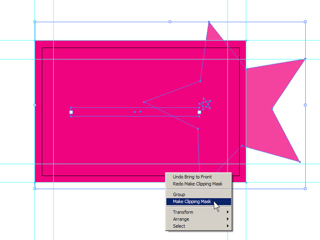
Now we are going to create a Clipping Mask to deal with our star graphic over-spill. Select the background box and copy it (CMD/Ctrl + C), then paste it in front (CMD/Ctrl + F). Still selected, bring the copied box to the front (Shift + CMD/Ctrl + ]). Select all (CMD/Ctrl + A) and then right-click and select ‘Make Clipping Mask‘ as shown above.
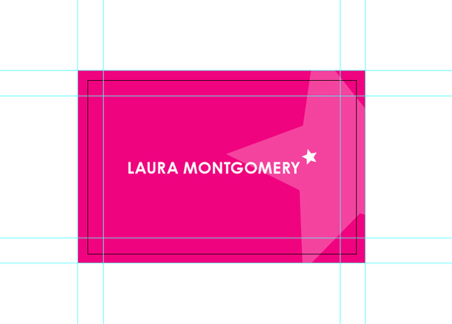
We now have our Clipping Mask in place and have completed the artwork for the back of the business card. Save your file (CMD/Ctrl + S).
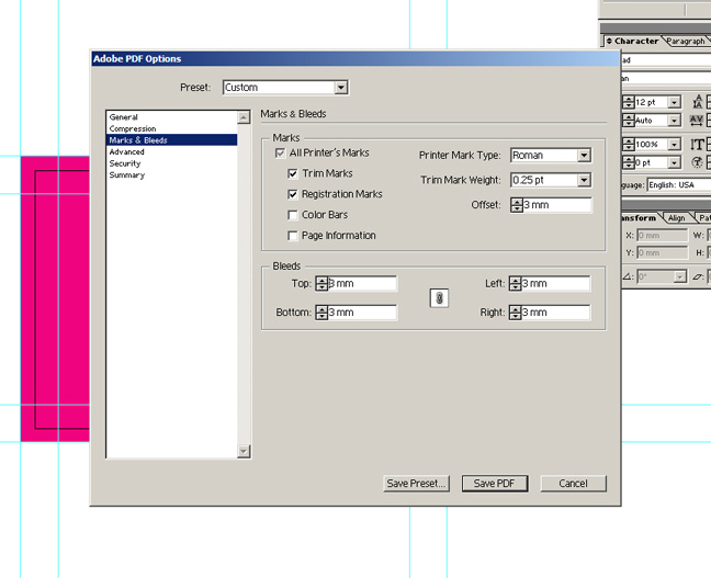
We are nearly there! Now it is time to save our file as a PDF and make it ready for print! This time Save As (Shift + CMD/Ctrl + S) and change the file type to PDF. Then make sure you are saving as a high resolution PDF (with no compression) and that you have the above Marks & Bleeds set.
Selected are the Trim Marks and Registration Marks, with the Trim Weight set to 0.25pt and the Offset to 3mm. The Bleeds are all set to 3mm.
Open up the ‘business-card-front.ai’ file and repeat the previous step, saving the file as a PDF ready for print.
Lastly, open up your PDF files and double-check you are happy with everything before sending your final artwork to print. Always worth double-checking are things like your contact details, telephone number and if you’ve spelt your own name correctly!
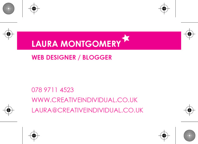
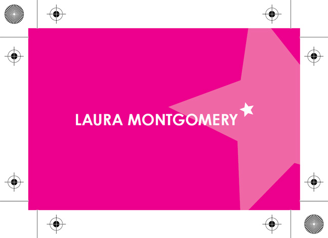
That’s it! You’ve now created artwork for your own business card which you can send to any professional printers. This example uses only magenta ink, however for one colour processing you could also use cyan, yellow or black to create a similar effect.
Further Reading & Inspiration
You can apply the techniques used in this tutorial to create your own designs. Use the links below to get some inspiration and see some fantastic examples of business card design:


 Creative Individual is written by Laura Montgomery, a Website &
Graphic Designer based in the lovely Lake District, Cumbria. Laura is a
nice girl who is always interested in hearing from others, so please feel
free to
Great tutorial. Thanks for sharing :)
Hey, glad you enjoyed it. I’ll be writing similar posts in the future for different corporate stationary and promotional materials.
Pingback: pixey.de » 27 Links zum Thema Visitenkarten » busniesscard, Design, Illustrator, Photoshop, Tutorial, Visitenkarten
Full color cards, or cards that use many colors, are printed on sheetfed presses as well; however, they use the CMYK (cyan, magenta, yellow, and black) four-color printing process. Screens of each color overprinted on one another create a wide gamut of color. The downside to this printing method is that screened colors if examined closely will reveal tiny dots, whereas spot color cards are printed solid in most cases. Spot colors should be used for simple cards with line art or non-black type that is smaller than 5 points…
My own, personal internet site
<http://www.caramoan.ph