By it’s nature the web can be a pretty cold place. Reading on screen can be hard and websites can look boring at times; and at worst, confusing and uninviting.
When we come across a site that’s different for all the right reasons, it often sticks in our head because it was an enjoyable experience. Can you remember a site that was warm and welcoming? Where the text was clear and easy to read? The navigation was easy to follow? That site was well-designed. Its designer had the end-user in mind at all times during the design process.
There are not always set ingredients which make the perfect website cake, but there’s certainly plenty of ways to improve your website, and in turn, a user’s experience; to make your site a nicer place to be.
The Design Devil is in the Detail
Without the extra attention to detail, websites can be pretty flat and boring, even ‘samey’. A lot of times they can look nothing like the world around us, making them hard to relate to and the online experience poor. This is a problem.
This is where we as designers need to take the extra step and design websites that people can relate to. When we design for humans, for the people who are actually going to be using our websites, we create better solutions to the design and communication problem we have been set. And often, designs appear simpler, cleaner and more elegant.
Already a lot of designers have taken this step and are designing websites that just make sense. Without the continuous changes in the web industry – the developments that have been made to figure out what works and what doesn’t – the internet would still be in its infancy in design terms. It was not so very long ago that we threw every trick we had into every website we designed and built; just because we could, and not because we should.
Dare I say it – we could still have an online world were animated gifs of glitter unicorns and bright green text on a black background are still the norm! Thankfully we have move on from this. But there is still much we can do to improve.
Design you can Relate to
This is where designing for humans comes into play. There are lots of articles which talk about User Experience (UX) and the User Interface (UI). And that’s not quite what I am about to explain. If you want to read about this, here are a few resources to get you started:
- inspireUX – User Experience quotes and articles
- SitePoint – How to Quantify the User Experience
- Jakob Nielsen’s Alertbox – Top 10 Mistakes in Web Design
- Webdesigner Depot – Strengthening Behavioural Cues in UX Web Design with Gestalt Principles
What I want to talk about is designing websites which look familiar to us, which look like the real world, which even have depth and dimension and actually ‘feel’ tactile. It’s these elements of design which make a visitor feel at home when they arrive at your website door.
So how can we achieve this?
1. Create a Light Source
In our lives away from the computer screen, our world has many light sources – the sun, moon, stars, street lights, lamps, candles, TV, etc. These create highlights and shadows on the multitude of objects in the world. They create different tones and shades of colour. And this gives our world depth and dimension – something not easily replicated on a flat surface such as a sheet of paper… or a computer screen.
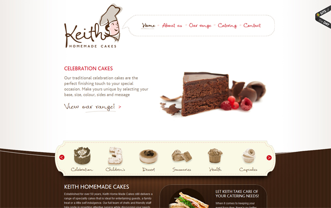
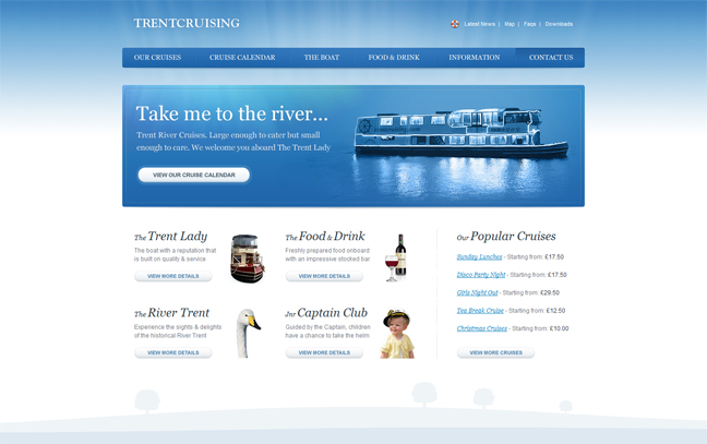
We can however replicate the effect of light using gradients and drop-shadows, to create the highlights and multitude of tones we see in the real world. Drop-shadows give us a sense of depth and allow us to place objects above and below others, creating a stacking effect and even a sense of third dimension.
Plus as designers we can use this effect to give objects priority over others; to draw the visitor’s attention towards a particular goal, such as a call-to-action.
Even with all this depth something can still seem missing.
2. Add Texture
Everything in our world has a texture. Whether rough or smooth, furry, soft, hard, cold, sharp or a whole host of other possibilities, everything is tactile and has its own unique feel.
Unfortunately we can’t re-create the actual tactile-ness of our world on screen (but how great would that be?) so instead we need to use visual clues of texture to convey the concept and to trigger the memory of texture in the mind of the site visitor.
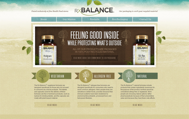
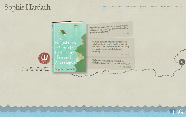
Well use textures are often subtle, so we need to be careful not to over-do-it. But when used well, texture can really set a website apart. Whether its the promise of sand between your toes from a holiday accommodation website or the prospect of great views and dirty shoes from an outdoor adventure centre site, texture can be a great asset in reinforcing the message in your site’s text, and the propose of the website itself.
3. Make it Look Real
People relate best to what they know. If a visitor comes to your website and has to learn a new visual language, chances are you’ve lost them.
By making your design elements look familiar, by basing them on their real-world counter-parts, you are placing your visitor into a world that they are familiar with and where they feel at home, rather than on an alien planet.
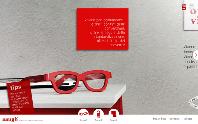
There are many ways to achieve this. It could be image slides that look like a stack of Polaroids, an events calendar that looks like a wall calendar, or the use of icons to represent information, such as telephone, email and postal address.
Some designers have even went a step further and created a website environment which looks and behaves like the real world. This solution isn’t easy to achieve, and nor will it be suitable for every design problem, but when it works, it really works!
4. Don’t Forget the White Space
So easy to get wrong, both by not spacing your content or by in fact over-doing-it. White space is just like a room – most of us can’t work in a messy room, so don’t make your site visitors read cluttered content. Because quite simply, they won’t.
On a pole to that, I believe that too much white space can also be a bad thing. Ever been in an empty white room? Talk about boring! Also by spacing out your content too much you can break the flow and make your page fragmented. Worse still, visitors might not even realise that there is any more content!
Note: White space is not empty space – it is a key element to great design and therefore should be carefully thought-out. It also does not have to be white.
5. Create a Hierarchy
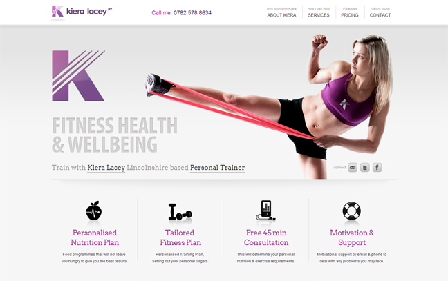
This is where careful consideration of your content comes into play. Whatever you’ve got – images, text, video, diagrams, even music – it all has to work together in a way that flows and makes sense. In its simplest terms, you’ll want to take a visitor from an initial simple concept, to overview content, to detailed content.
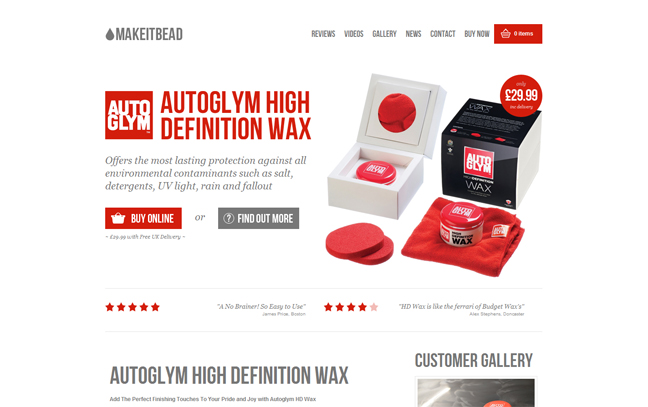
Take the example of a website promoting a product. Often you’ll have a simple line or two of text along with the ‘hero image’ which explains the product (or its purpose) on a very simple level. If the visitor likes this, they often get 3-4 key features of the product, maybe a demo video, maybe a testimonial, and in certain cases a bit about the company. If any of these is of interest to the visitor, they can usually read more on a new page which goes into detail.
The visitor gets the information that they want, in the level of detail that they want, and the content flows easily from one level to another. This is effective use of hierarchy in your website content.
6. Make it Legible
Building on the previous two points, make sure the visitor can read the content. No matter how great your site’s design is, chances are that the visitor is there for the content. By making effective use of layout, white space and hierarchy, you can make content more accessible to the visitor.
Other simpler considerations we as designers need to be aware of are font size, use of titles to break up text and create sections, and contrast between the text and the background (and remember that too much contrast can also be a bad thing).
7. Push Your Unique Selling Point
As much as we like things that are familiar to us, we also like it when we come across something that is different or even unique. If your website has a unique selling point, or is selling a product or service that is doing something different, use this to your advantage and push its unique selling point to its limits.
However if you are creating a website where the subject matter is fairly run-of-the-mill, then you may want to find a different design solution to communicate to the site visitor, to help you stand out from the crowd.
After all, variety is the spice of life!
In the End, It’s All About the Site Visitor
Design considerations which keep the end-user in mind can go from fairly skin deep decisions, such as text and background colour, to more thought-out and carefully considered decisions that can affect the whole site’s layout.
What I have discussed above is by no means an extensive list but points which I hope highlight the importance of good design choices in order to make a successful website that people will want to spend time on.
I am sure that there are many more points which come into play in your design process, some of which I may not have even considered. And I hope that you’ll share these in the comments below.


 Creative Individual is written by Laura Montgomery, a Website &
Graphic Designer based in the lovely Lake District, Cumbria. Laura is a
nice girl who is always interested in hearing from others, so please feel
free to
Lovely to see one of our sites http://www.klpersonaltrainer.co.uk used as positive example for designing for humans and the importance of content hierarchy… thnx for the feature
Fantastic website. Lots of helpful information here.
I’m sending it to some buddies ans also sharing in delicious. And certainly, thank you for your sweat!