This week’s mid-week inspiration is a small collection of only 3 sites but ones which I think are good enough to stand up as prime examples of an emerging trend.
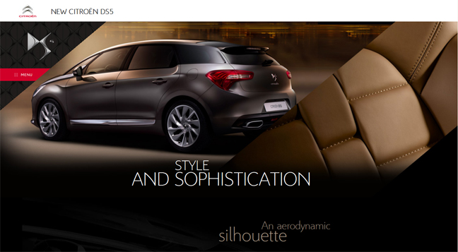
Recently I came across the Citroën DS5 website which blew my mind. Using bold diagonals and lots of CSS3 transitions and Javascript to create some mind boggling animations, this site shows what can be done when technical capability and extraordinary imagination meets the guts to give it a go.
Check out this week’s short, but very sweet, collection of inspirational sites which use diagonal lines and animation to drive home their message:
Citroën DS5
Starting with the site that brought my attention to this trend, the Citroën DS5 website uses smooth, sliding animations, fades, and zooming effects to create a truly interactive experience. The key messages fade in on page load, while images and body text slide in when you scroll down the page. Plus there’s some layering and parallax style effects with page elements floating above and beneath one another. They have even taken the diagonal element into the site navigation.
http://www.ds5.citroen.co.uk/uk/
Redirect Digital Marketing
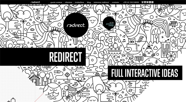
This example from Redirect Digital Marketing combines stylised illustration from Jonathan Calugi with similar effects that we previously seen in the Citroën DS5 site. The animations and illustrations really bring out the company’s personality, and shows that they are at the forefront of online design and development. What better showcase could an agency ask for?
http://www.redirectdigital.com.br/
Hyundai Veloster
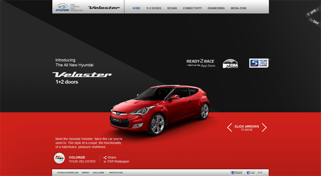
Not only have the designers of the Hyundai website used great animation effects but they have also used a simple and effect design too. I personally love how they have played with the (mostly) diagonal line to create different dimensions and floors for the car graphics to site on. Plus some beautiful typography really finishes the design off. Good work!
http://www.hyundai-veloster.eu/
Conclusion
I will be the first to admit that this trend won’t work for every site, in fact I think very few sites could pull it off! However for those projects which can accommodation such a daring design, what better way to showcase your product or company than with a site that is so exciting and engaging? This is one trend that I love.
What did you think of this week’s collection of Mid-week Inspiration? Which site is your favourite? Do you know of any other sites using this style to communicate? Please share them in the comments below along with your thoughts on the trend.


 Creative Individual is written by Laura Montgomery, a Website &
Graphic Designer based in the lovely Lake District, Cumbria. Laura is a
nice girl who is always interested in hearing from others, so please feel
free to
Spot on with this write-up, I really think this website needs a lot more attention. I’ll probably be returning to read more, thanks for the information!